I am not unaware of the fact the people like categories. After all, there is hardly a more convenient crutch. When it comes to photography, there is a particular downside to that: Once you live in one category, be it as a creator or as a presenter of photography, you’ll inevitably be/become/remain one-dimensional. It keeps to amaze me how, e.g., people who are well regarded in field of “fine art” promote incredibly stuffy aesthetics that would make any good contemporary advertising photographer cringe. Or the grandiose, self-absorbed art school person that couldn’t come up with a decent news photo even if if a space ship from Mars landed right in front of her.

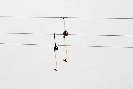
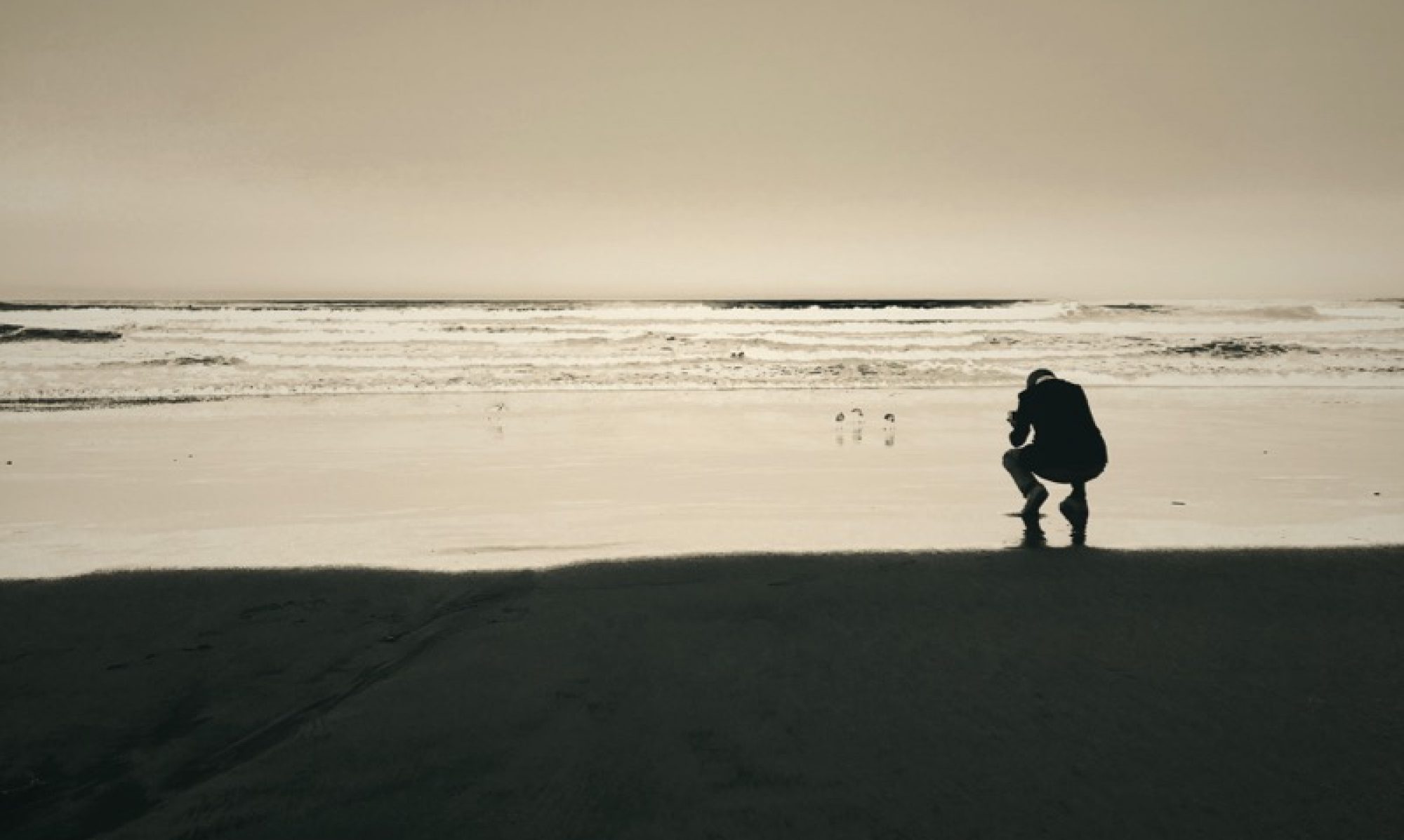
Personally, I’m always on the hunt for the elusive image that works in more environments than one. Of course, 999 times out of 1000, I fail. The above image is one example for that kind of failure: It’s somehow not a bad image. In a commercial environment it would license well, but on a wall it does not hold its own (the image is from about four weeks ago, and I actually have a series from that day that may work better. But then, I don’t like images that work *only* as part of a series).
